
Wealth Foundations Partners
This was a full website build from the ground up. I partnered closely with stakeholders to define the brand’s digital identity and create a site that not only reflects their values but guides customers through complex financial topics with clarity and confidence.
Year
2025
Client
Wealth Foundations Partners
PROJECT OVERVIEW
Discovery & Stakeholder Collaboration
I began with discovery sessions to understand:
The company’s core services and unique value proposition
The target audience’s financial pain points and literacy levels
The team’s vision for tone, branding, and trust-building
We conducted interviews, competitive analysis, and content planning workshops to ensure that the site would resonate with both first-time investors and seasoned clients.
Goals & Business Objectives
Build an intuitive site that demystifies complex financial topics
Establish trust and credibility from the first impression
Convert visitors into leads through clear CTAs and contact flows
Offer scalable content space for future educational resources
Ensure the site reflects modern professionalism with warmth
UX Strategy & Solutions
Brand Foundation First: Developed a consistent color palette, typography system, and tone of voice to match the brand's approachable expertise
User-Centered Architecture: Designed a site map that flows from awareness → education → conversion
Service Cards with Visual Cues: Used icons and clean cards to break down services like coaching, retirement planning, and investment literacy
Trust Builders: Integrated testimonials, credentials, and an About page focused on the team’s human side
Conversion-Driven Layouts: Strong CTAs across the homepage, service pages, and contact flow, all using warm language and smart placement
Scalable CMS (if applicable): Designed the site to grow with blog, resources, and content modules later on
Mobile Optimization: Responsive layout for seamless access across devices
Results
Stakeholders reported stronger client confidence and more incoming inquiries within the first month
Clear content and layout improved lead quality by helping users self-select before contacting the team
The site now serves as a central hub for the brand’s coaching, resources, and financial tools
User feedback praised the site for being “simple, clear, and professional, without feeling cold or corporate”
SCREENSHOTS


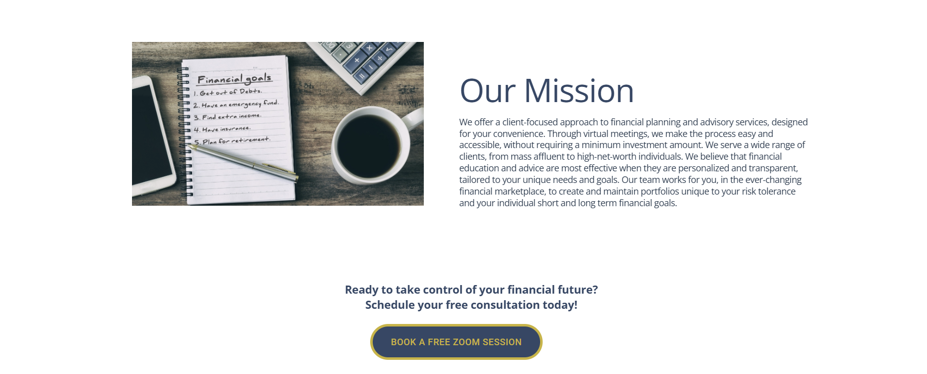


Home Page
About Us
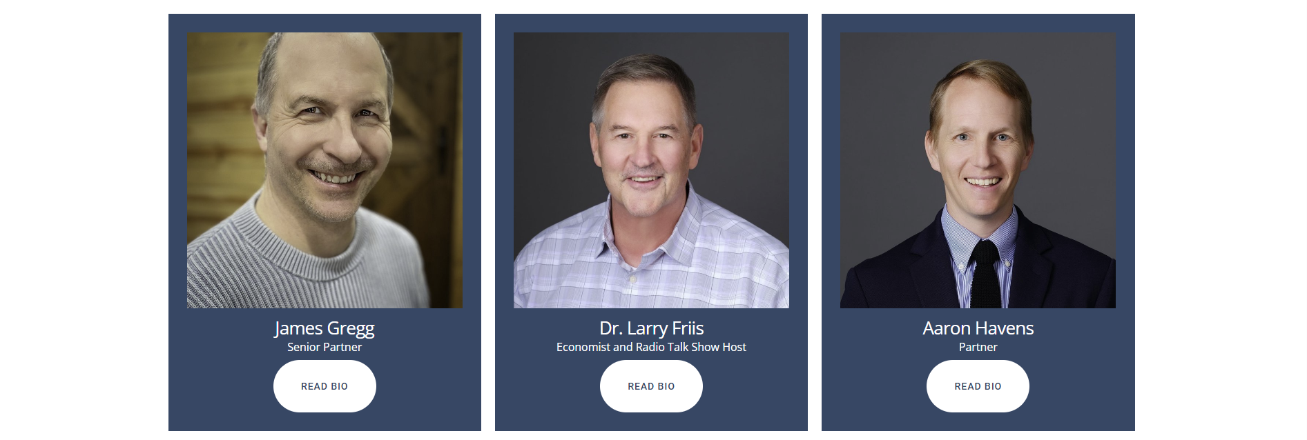
Our Team
Next Steps
Integrate a blog or learning center for ongoing financial education
Add scheduling features for free consultations or webinars
Incorporate more interactive tools like calculators or quizzes to support user goals